How to Build a High-Converting FAQ Page
- by Alyson Shane
Wondering how to create a high-converting FAQ page for your website?
It's easier than you think!
This under-valued page can serve as one of the fastest ways to move potential customers through your conversion funnel. After all: anyone who's landed on this page has already shown that they're looking for more information about your business - meaning they've moved to the consideration phase of the purchase process.
Now, your FAQ page can give them the info they need to finalize their buying decision.
Many businesses don't use FAQ pages effectively, or add them as an afterthought to their website as a way of fielding potential customer service calls.
In this post we'll show you how to build an FAQ page that drives conversions:
What Do FAQ Pages Need?
FAQ pages need to have a purpose.
Don't just add one because you feel like you should have one, or because you're trying to create more pages on your website. Bad FAQ pages can drive visitors away from your website, muddle your marketing messaging, and damage your brand's reputation.
Below are some of the must-haves for your FAQ page:
Relevant Questions
Remember: your FAQ page is where your customers look for answers to their questions, so make this page about them.
Leave information like your company history, how many employees you have, etc. to your About Us page. Irrelevant questions keep readers from finding the answers they're looking for, which can make them frustrated and angry.
How to Find Questions for FAQ Pages
Still not sure how to ask the "right" questions on your FAQ page?
Just take a look at what your customers are saying! Take some time to review comments and questions from:
- Phone support.
- Submission forms.
- Customer emails
- Social media comments and direct messages.
- Live chat.
- Sales meetings.
Use a spreadsheet or a tool like this one HubSpot offers to keep track of all questions and customer feedback. The topics and questions that come up the most often are the ones you should address on your FAQ page.
Simple Navigation
Don't make people hunt for answers on your website.
Your FAQ page should be where they can have their questions answered. If your visitors can't find the answers they're looking for, then your FAQ page is failing you.
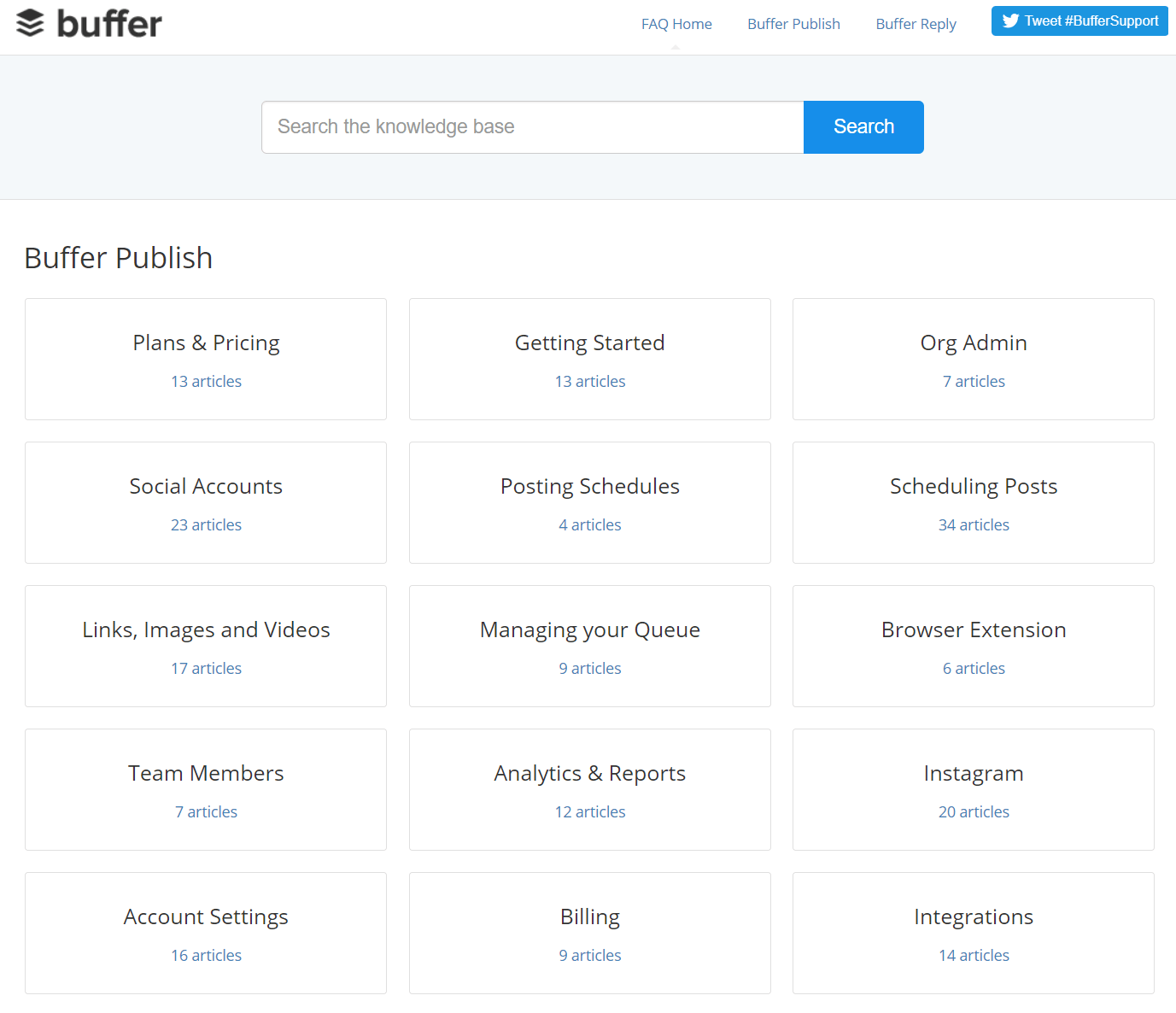
If you have a ton of documentation, like a lot of SaaS (software-as-a-service) companies do, then consider using Buffer's FAQ page as inspiration to keep your answers organized:

Image via Buffer
This page has a simple, basic design that helps direct visitors to a number of topics. It's a really clever way to "silo" lots of information for data-heavy services!
Even if the visitor has lots of questions, they can still easily find the answers they're looking for.
Short Answers
Use the K.I.S.S. methodology: Keep It Simple and Strong.
Keep your FAQ answers short and concise, and avoid in-depth answers and explanations whenever possible. Keep those long-form explanations for blog posts (like this one).
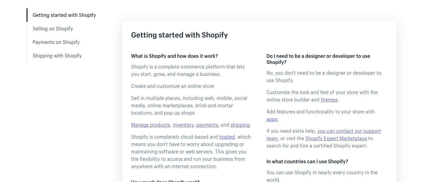
Shopify has a great example of an FAQ page that doesn't use a search bar. There aren't a ton of questions (just 14 total) so visitors probably don't need to search to find a specific answer.


Image via Shopify
All you need to do is click on one of the four left-hand topics, or just scroll down to see all the answers on one page.
Search Bar (When Needed)
Installing a search bar empowers visitors to find the answer they're looking for, and has an added advantage of allowing you to track their search queries.
Which brings us to our next point...
Search Engine Optimization (SEO)
FAQ pages are a great way to inject a little extra SEO (Search Engine Optimization) into your customer service experience.
Most businesses build FAQ pages with the assumption that a visitor will arrive there after looking around the website and seeing something that leads them to the FAQ page.
However, you can also build your FAQ page to attract traffic directly from search engines.
You can do this by framing your question in a way that isn't exclusive to a product or service you offer.
Extra Support (When Needed)
Sometimes, your FAQ page just isn't enough.
If it's going to take a little extra work to get some visitors to convert, that's OK. Just make sure that they know the option for more support is available to them.
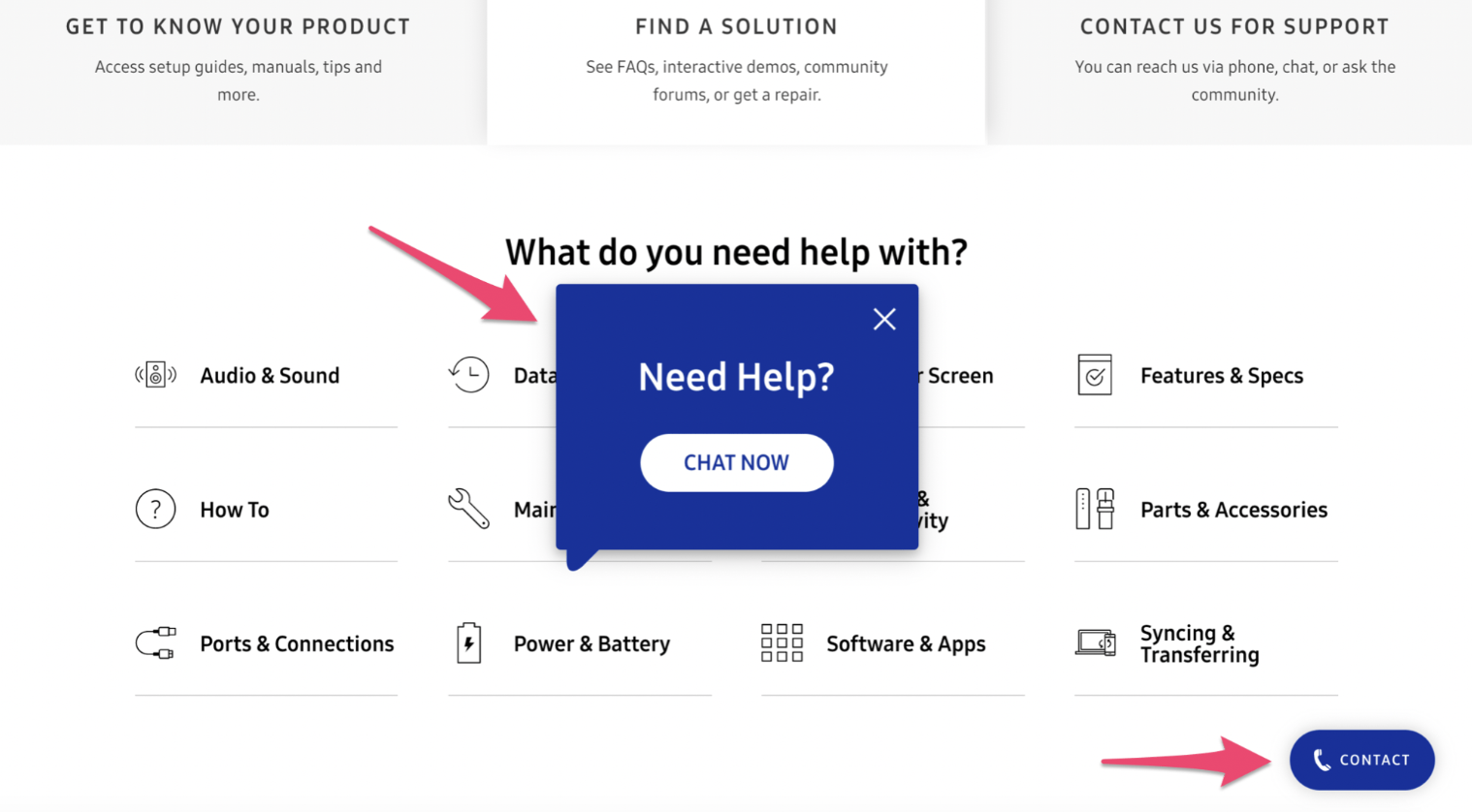
We love how Samsung approaches their FAQ page:

Image via Samsung
Samsung is a huge company, so it makes sense that their FAQ page has lots of information available when you first arrive.
But if you don't do anything for a few seconds (maybe you're overwhelmed with the choices) a pop-up window appears promoting a live chat session.
This is a much better approach than expecting the visitor to click around and find the support page they're looking for, or hoping they read multiple articles looking for their solution.
This extra effort of connecting your customer with the information they're looking for will go a long way, trust us.
Conclusion
FAQ pages are important resources for your customers - don't neglect them!
People visiting these pages are on the verge of converting, and sometimes all it takes is the answer to a question to help them decide to buy.
By building FAQ pages that are customer-centric, optimized for SEO, and easy to navigate, and watch your conversions roll in.
Want more resources delivered right to your inbox every week? Subscribe to our newsletter!

