6 Ways to Improve Website Conversion Rates Today
Conversion rates are the most important part of any digital marketing campaign.
That’s what websites are for, after all: attracting an audience and “converting” them into a customer.
Whether you’re a newbie or seasoned digital marketer, knowing how to track and increase your conversion rates is one of the biggest factors in making sure your website is generating new business.
Why do conversion rates matter?
Conversion rates matter because they allow you to track the return-on-investment (ROI) of your marketing and advertising, and can help you spend your budget more strategically.
An effective marketing campaign will get a lot of people to take action and convert, so tracking when users “bounce” away from a page (aka, visit a single page and leave without taking an action) and when they convert can help you make better digital marketing decisions.
What’s the average conversion rate in 2022?
According to WordStream, the average conversion rate for a landing page is 2.35%. However — this stat needs to be taken with a grain of salt.
Conversion rates vary across industries. This makes sense: it’s easier to decide to buy a $10 item than invest $10,000 in a piece of software — which is why this in-depth study by Unbounce spanning 74.5 million visits to more than 64,000 landing pages across a wide variety of industries found that the median conversion rate hovers closer to 3 — 5.5%
If this stat feels intimidating, never fear! Today we’re going to cover some simple steps you can take to start improving your website conversions today.
How to improve website conversion rates today
1. Don’t make people log in
If you have an e-commerce website that always makes people log in, then odds are they won’t be your customer for long.
Think about it: if you had to log into a website every time you wanted to buy something, would you? Or would you order from a website that doesn’t make you remember your email and password every time you want to make a purchase?
Spoiler alert: most of us won’t bother. In fact, a Baymard Institute study found that 37% of users will abandon their cart completely if they’re forced to create an account.
How to avoid using logins
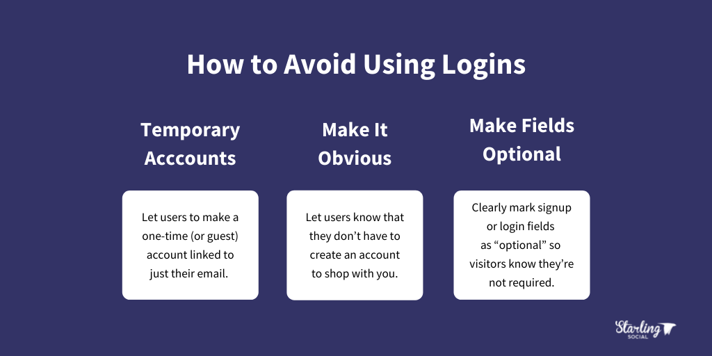
- Allow temporary account creation. Allow users to make a one-time (or guest) account linked to just their email.
- Make it obvious. Let users know that they don’t have to create an account to shop with you. A clickable “check out as guest” button is ideal here.
- Make fields optional. Clearly mark signup or login fields as “optional” so visitors know they’re not required.

2. Personalize or localize content
We love buying things that feel custom-tailored to them and their needs.
People are 91% more likely to shop with a brand that offers relevant offers and recommendations, while 72% say they only engage with personalized messaging and offers.
This can include localized content (content offered based on where they live), content based on past purchases, searches, items they’ve viewed on your site, or ads they clicked on.
How to offer personalized or localized content
- Optimize for local SEO. Make sure to optimize your website content to rank on a search done by someone in your area, since this can help you rank higher.
- Publish relevant content. Share content that users can connect with at various stages of their buying journey and that shows how your product or service solves their problems.
- Personalized discounts. Offer unique discounts to people based on past purchases, their location, or how they’ve interacted with your site.
3. Add more social proof
“Social proof” is a term that’s been around since 1984, when author Robert Cialdini described it as “as people doing what they observe other people doing”.
Basically, your audience isn’t automatically going to believe what you say, so if you’re claiming you can do something then you need to show proof that your claims are true.
Adding social proof to your website is one of the best ways to increase conversions. In fact, a study from TrustPulse found that adding social proof to your website can quickly improve customer trust and increase your conversion rate.
Here are some stats from the study for you to consider:
- 97% of consumers look at reviews before purchasing
- Testimonials can increase conversion rates on sales pages by 34%
- Having at least 5 reviews causes purchase likelihood to increase by a factor of nearly 4X
How to add social proof today
Below are a few quick steps you can take to use social proof to increase conversions:
- Add customer reviews. This is especially true for e-commerce websites which should consider adding a dedicated “reviews” section.
- Include case studies. Case studies are the process of making stories and blog posts out of your successes. They showcase the difference you make and the specific outcomes of working with or buying from you.
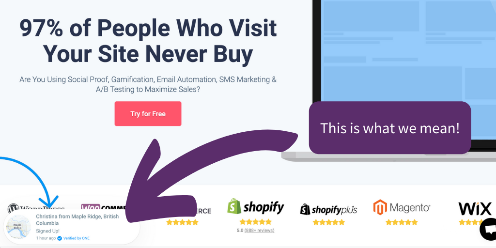
- Use social proof pop-ups on sales pages.* Using pop-ups strategically can showcase how often people are buying, leaving reviews, and more. Below is an example from Proof Factor that shows what we mean.

* Important: we suggest using popups sparingly, or in ways that are non-intrusive to someone’s experience using your site. After all, your goal is to highlight how great your business is, not annoy visitors to your website!
4. Do an SEO Audit
Your website could have the best user experience on the planet, but if your website is slow or isn’t getting indexed by Google properly, then your customers won’t even find you.
The more people who visit your website, the higher you’ll rank on a search engine results page (SERP), and the higher your conversion rates will be.
(Looking for info on how to keep your blog posts ranking highly on the SERP? Click here!)
One study found that websites that rank first place on Google have a click-through rate of 31.7%, and another found that only 25% of all users ever bother to click on a website that ranks on the second page of a search result.
This means that making sure your website ranks as high on a SERP as possible is critical to increasing conversions — luckily the fix is simple:
SEO audits will show you where your website could be updated and optimized to help it rank higher. This will allow you to attract more organic (unpaid) traffic and improve those conversion rates.
How to do an SEO audit
- Buy a tool and do it yourself. Services like Ahrefs, SEMrush, and ScreamingFrog are all great tools to help you identify what needs fixing.
- Hire an agency or SEO expert. Ditch the DIY process (which can be time-consuming) and let the pros handle it for you.
5. Shorten your forms
While longer forms can help you learn details about your customers, forms with lots of fields can be annoying and cause people to avoid filling them out at all.
To keep visitors from feeling frustrated and reduce bounce rates on your landing pages, consider including only the most important information in your forms.
Need more proof? Marketo ran a test where they created two forms: a short, and a longer version, and compared their results. They found that a 9-field form conversion rate was 10%, while a 5-field form conversion rate jumped up to almost 14%.
How to shorten your forms
- Only collect essential information. Focus on the most important information (name, email, etc.) and collect everything else in emails, surveys, and follow-up calls.
- Use a 3rd party account to collect information. If you can, give users the option to log in with Google or Facebook so they can stay logged in and you can collect their information automatically.
- Even better: getting people to log in using Facebook can help with your Facebook ad targeting!
6. Keep It Simple, Stupid (K.I.S.S. methodology)
Keeping your forms short isn’t the only thing you can do to increase conversions! Think about ways you can make the experience of visiting your website easier.
Making your website easy for people to use is a cornerstone of modern user experience (UX), as described in this post from CareerFoundry.
In it, they share that people have much shorter attention spans than even just 10 years ago and cite an experiment by Etsy where they slowed down some of their mobile pages to see what would happen — and they saw a 12% increase in bounce rates!
Aka, 12% more people left the page without taking a single action than if the web page had loaded more quickly.
But keeping your website easy to use isn’t just about good UX design and load speeds — WPForms found that a whopping 67% of users will abandon a form if they encounter any issues filling it out.
How to give your website the K.I.S.S. of approval
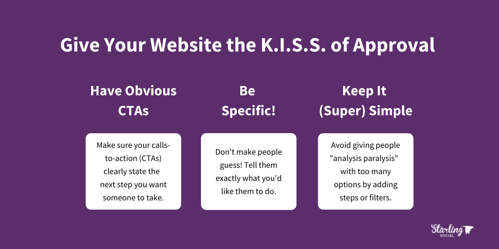
- Have obvious calls-to-action (CTAs). The next step in the buying or contact process should be obvious right away. Don’t make people guess what to do next!
- Tell people what you want them to do. Be specific! Tell them where to click, the information you want them to enter, and how to find specific details.
- Keep it (super) simple. Offering too many options can give people “analysis paralysis” and make them opt out completely. Instead, add steps or filters to help them choose from multiple options.

Improve website conversion rates today
High conversion rates are how you know that your marketing is working, that your website is giving customers what they need, and ultimately how you grow your business.
By applying the strategies listed above you can help your customers have a smooth, seamless buying experience and turn them into repeat customers.
Want articles like this one delivered right to your inbox once a week! Subscribe to our roundup of digital marketing news and be the savviest business owner or marketer in the room.

