Tagged: graphic design predictions
Graphic Design Trend Predictions For 2026
- by Chelsée Cure
With the increasing ubiquity of AI-generated content, the graphic design industry is grappling with one central question: How do we bring the human back into the craft? Design is a direct reflection of culture, and we are seeing a shift toward punk, counter-culture imagery and a deliberate push-back to the hyper-polished, minimal designs of years past.
The year 2026 will be defined by a dynamic tension: a powerful push toward human presence, texture, and craft and a simultaneous, intentional embrace of engineered precision and drama. So how is that going to look?
The Human Touch: Curated and Messy
The most significant trend is a cultural rejection of sterile perfection. Designers are leveraging imperfection and physical textures to create authenticity and connection in a world saturated with clean, seamless AI output. This shift marks the return of texture and visual depth, moving away from minimalist, flat designs. These rejections will go in a number of directions.
Entering our Rebellious Teenage Era
We’re seeing a major uptick in counter-culture aesthetics, we’re seeing chaotic, high-energy designs, deliberately unpolished or loud typography and gritty textures that revolt against the clean minimalist perfection of previous years.
Grit and Grain
After years of sleek, perfect digital looks, graphic design is now embracing imperfect and gritty textures. This popular trend uses elements like film grain, intentional blurring, rough edges, faded colors, and worn paper effects to give designs a more raw, authentic, and candid feel. It looks like old-school film photos or handmade collages, intentionally moving away from sterile perfection. This shift is happening because both people and brands want to feel more genuine and human, using these "flaws" to build trust and connection in a world filled with overly polished or AI-generated content.
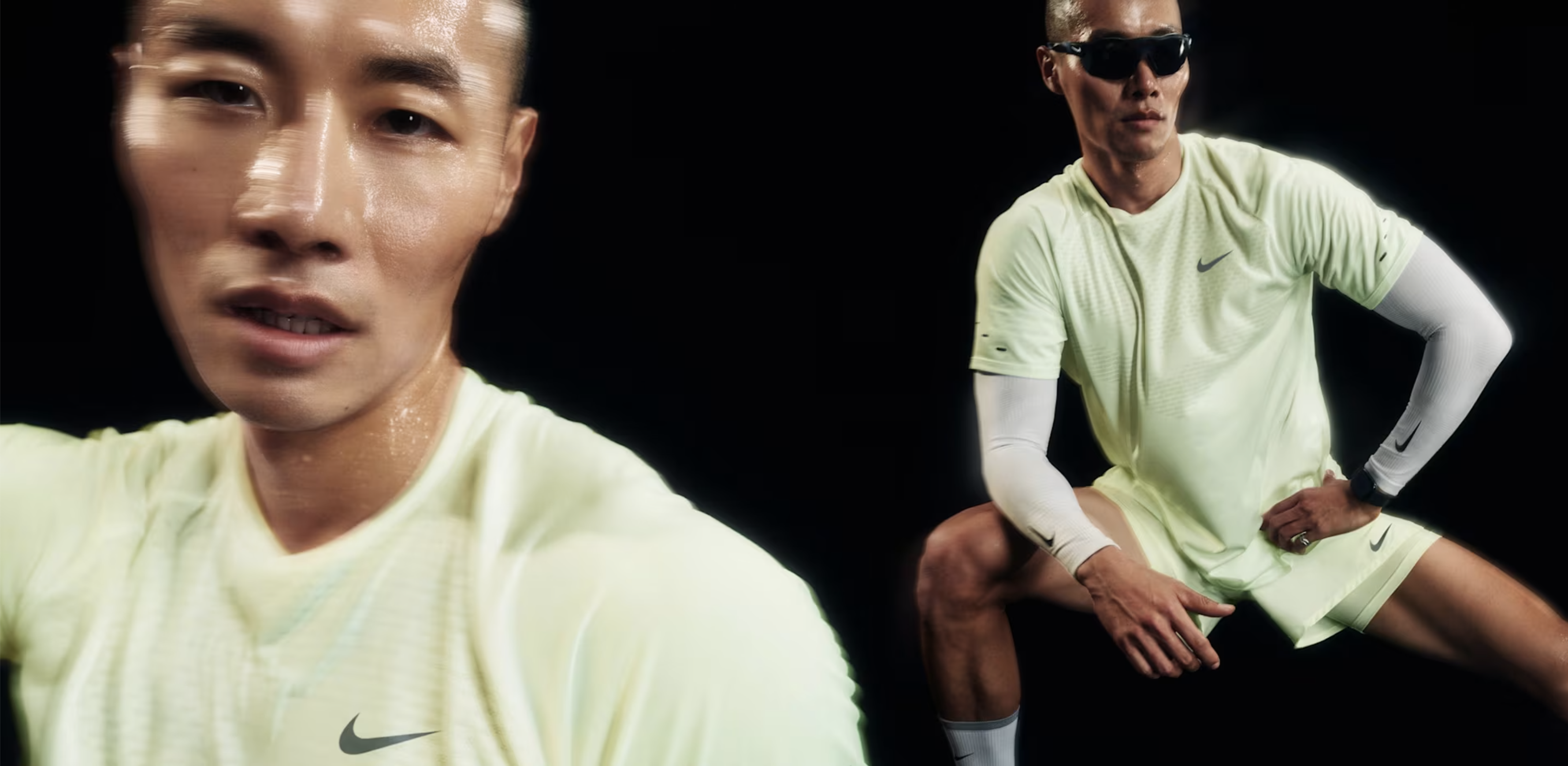 Nike Blurry Imagery
Hyperindividualism
Hyper-Individualism is all about using design to stand out fiercely against everything else. It rejects boring, safe looks by using unique, bold visuals that are hard to ignore. It’s less about following design conventions and more about standing out.
Lululemon social media graphic.
This style relies on custom, highly expressive fonts that are often warped or messy, acting as art themselves. It heavily layers 2D and 3D graphics together, mixing flat shapes with lifelike or totally surreal (dream-like) images to create deep, busy, and sometimes chaotic visuals.
The whole point is to look completely original, making the design feel like a loud, defiant statement of unique personality so it can never be mistaken for anything else.
JBL noise cancelling headphones ad.
Punk, Grunge and Total Anarchy
The noisy, rebellious look of punk and grunge design is very popular again. It's loud, messy, and meant to stand out. It uses textures that look like bad photocopies and features ransom note-style letters that appear cut out and mismatched. With its chaotic layouts, distressed edges, and raw, amateur feel, this aesthetic is the "angry teenager" of design. Its comeback shows that people are craving an authentic, gritty style that rejects perfection and lets them express frustration and individuality.

Get out your glue sticks, it’s craft time.
Hand-Drawn Graphics
This style celebrates hand-drawn imperfections and has a familiar, almost nostaligic feel to it. . This style relies on organic elements like whimsical florals and patterns, along with ornamental, uneven borders that look hand-painted. Colors are often rich and vibrant, giving the designs a feeling of history and cultural connection. It uses simple, heartfelt elements, and offers a comforting and sincere alternative to super-modern aesthetics.

Ikea hand-drawn throw pillow graphic
Tactile Crafts and Collage
The Tactile Crafts trend actively rejects clean digital perfection by bringing a handmade, human feel to visuals. This style is achieved through techniques that make the work look like it was physically put together, not just designed on a screen. Key elements include dynamic collages made from fragmented photography, paper cutouts, messy scribbles, and deliberate unevenness. By showcasing these rough textures and visible layers, the design feels more immediate, sincere, and relatable.

Ads of the World - The Village
Taking tech to the next level
With advances in technology, it’s now easier than ever to feature hyper-realistic visuals and further blend the lines between the physical and digital world. In my early graphic design courses, the question was often “sure, but does it translate to print?”. It feels like we’re letting that focus go and seeing just how much we can do with digital graphics.
Hyper Realistic Visuals
Liquid Glass
The Liquid Glass design style is rapidly becoming a popular aesthetic in modern UI, as seen in Apple’s new OS update. Characterized by high-fidelity realism, it features elements that simulate the optical properties of dynamic, fluid glass, including subtle blurring, light reflection and refraction, and dynamic translucency that adapts to the content underneath. This style creates a sense of layered depth and elegance, making interfaces feel alive and tactile.
Apple Liquid Glass
Skeuomorphism
As we work to blend the physical and the digital, we’re seeing a resurgence of skeuomorphic design; realistic textures and graphics that reflect the physical structure. This design style was very popular in early interfaces as a way to familiarize new users with digital counterparts of things like a notepad, camera, or microphone.

Medium - Early Apple skeuomorphism
The resurgence of this design style is more about realism and blending minimalist design styles with realistic textures; think woodgrains, leather, paper textures applied in the digital sphere.
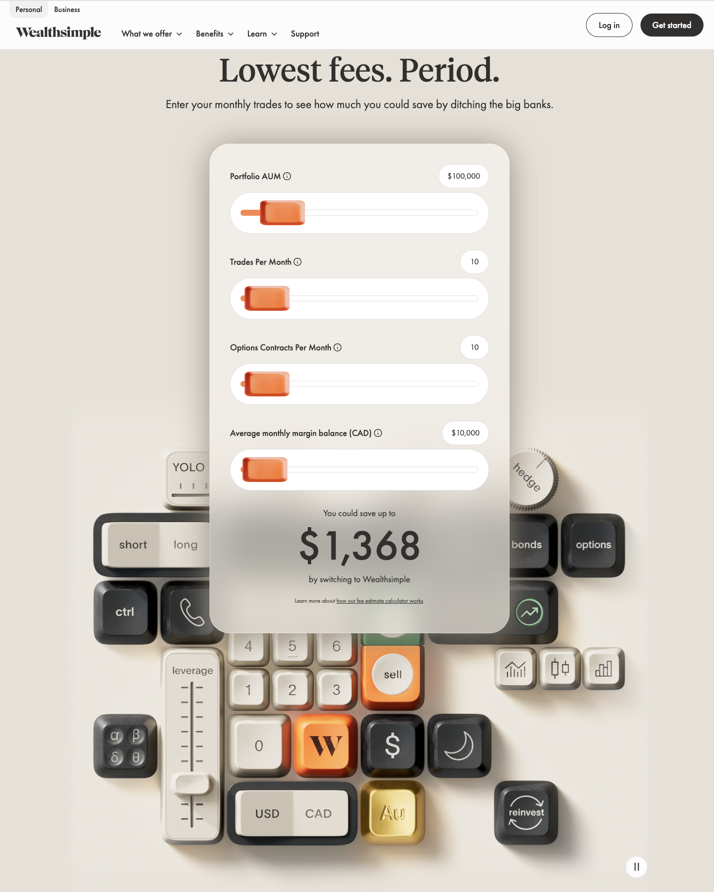
Wealthsimple skeuomorphism
Dynamic Gradients
Google recently changed up their logos to gradient designs, Siri, Open AI, also have gradient design.
Gradients are also being used to add texture, using grainy, pixelated gradients adds some imperfection to otherwise clean and seamless content. Gradients are being used to break up text blocks and create visual hierarchy in an interesting way.
If you can’t beat em, join em.
AI-generated content has been around for a few years. It feels like yesterday our social media feeds were full of Midjourney-generated profile pictures, it was a simpler time. AI is now graduating from being a novelty to a valuable tool in branding and graphics development.
It’s being integrated into designers processes to
- Generate Design Systems: Instantly producing full sets of brand-compliant assets (icons, colour palettes, social templates) from a single prompt.
- Accelerate Iteration: Creating dozens of colour or font pairings for an ad campaign in seconds, allowing the human designer to focus entirely on creative strategy.
The trend isn't the output itself, which can still be a bit dodgy and unpredictable, but the efficiency and personalization it enables. The designer still has the controls and vision, but AI can iterate and speed up previously tedious processes.
The Bottom Line: Authenticity Over Algorithm
I will quote a 90s PSA and say “nobody's good at everything, but everybody's good at something… so what’s your thing?” It’s fun to predict what’s next for the design world, but remember that authenticity never goes out of style. Your goal is not to adopt every aesthetic listed here, but to cherry-pick the elements that enhance your brand story and genuinely resonate with your audience. Trends are exciting, but a consistent, clear brand identity is timeless.