Tagged: Call-to-Action
10 Creative Ways to Optimize Your CTAs
- by Emily Weidenbacher
This is a guest post from our social media intern, Emily Weidenbacher
A call-to-action (or CTA) is an essential part of your marketing copy that tells the reader exactly what action to take next, like a button that says "subscribe here!" or "sign up here".
A CTA is a simple way of helping your customers interact with your webpage or social media feed.
If you're having trouble finding inspiration for successful and effective CTAs (and some similar ideas), look no further! We've got you covered.
Here are the top 10 examples of creative calls-to-action.
1. Make it front and center

Wordstream used the entire top third of their website to grab their readers attention, and most importantly, they're telling their audience exactly what they need to do, why they should do it, and that it's free.
Why it works
- It's the first thing you see when you click on their page
- It's clear and straightforward
- Consumers can't click away unless they leave the page
2. Get it while it's hot!
Time Magazine has given their consumers a time limit on a great deal for a subscription for their platform!
Creating a sense of urgency is a great way of enticing those consumers who may easily click away without a second thought.
Why it works
- The text creates FOMO (Fear Of Missing Out) the consumer can't waste any time capitalizing on this deal
- The persuasive language such as "flash" and "hurry" increases urgency and the fear of missing out on the opportunity
3. We all win!
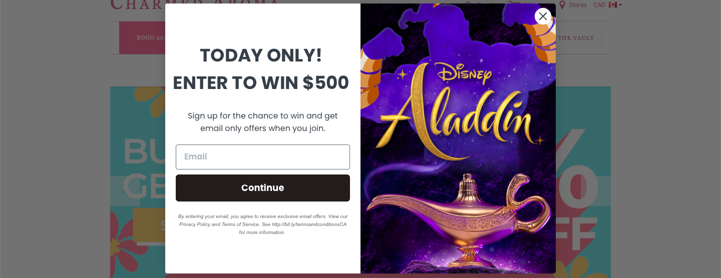
Try thinking outside the box with a little sweepstakes like Charmed Aroma!
The reader gets a chance to win one of your products or a prize of your choosing, and in return, you win some shiny new subscriptions! It's a win-win situation.
Why it works
- The reader has nothing to lose by both signing up and entering to win the $500
- The image both promotes their products and makes the ad flashier and more colourful
4. Drop the formalities
Depending on your brand, try incorporating some humour into your CTA.
Companies like Who Gives a Crap love have built their brand off of not taking themselves extremely seriously while still retaining a successful business model. It's okay to embrace the silly every once in a while!
Why it works
- Humour makes the company more relatable
- Everybody loves to laugh, especially when it's a potty joke
5. Take advantage of an urgent situation

Sometimes you need a solution to your problem ASAP.
Without even clicking on the website, GL Pest Control lists their phone number for an instant phone call.
Since most people want to call an exterminator right away, listing your phone number can capitalize on those who need your services as soon as possible.
Why it works
- It gives the reader the next step as part of the CTA
- It's straightforward and presents a clear direction: Call
6. Pique people's interest
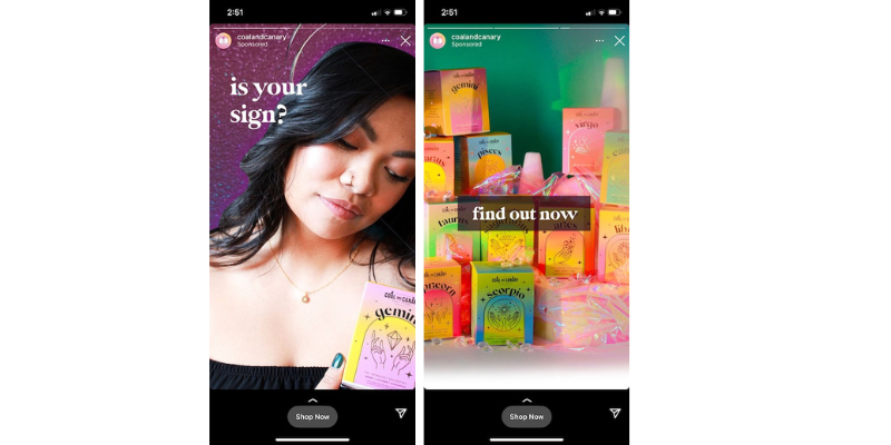
We all need to know the answer )) whether it's a Buzzfeed quiz or a random Facebook quiz, we all need to know which Simpsons character we are or which Disney prince or princess is our soulmate.
Keep your audience guessing and lead them to where they'll find all the information they're just itching to know.
Why it works
- The ad is specialized for everyone that clicks on it )) everyone has a zodiac sign and a personal piece of e of eZodiac Cole!! to go with it
- It keeps them guessing. Plus, they might have a little fun finding out more about themselves!
7. Less is (often) more
Simplicity will never go out of style. A simple “Book now!”, “Subscribe!”, or “Shop now!” is enough to catch someone’s eye.
Why it works
- The words and the image are cohesive and don’t overpower each other
- “Book now” is present and maintains the calming energy of the rest of the advertisement
- The language surrounding the image – “Grab your passport and go.” – is direct and promotes the same energy as the image
8. Pull at those heartstrings

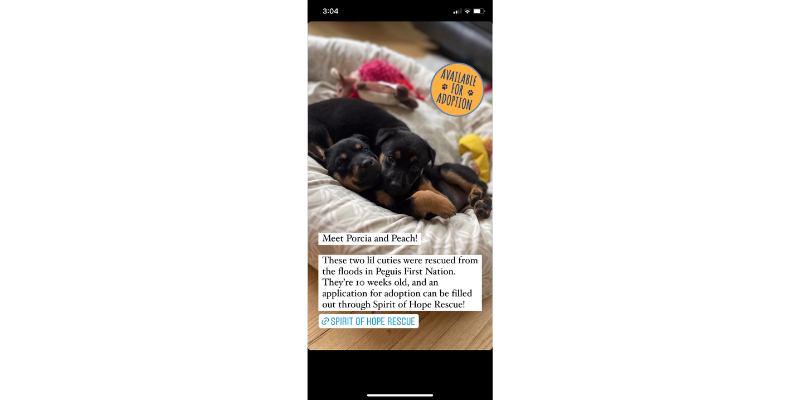
Use what you’re promoting! If you have little puppies or kittens that need a home, let the world see! Relevant images to your CTA will help you reach your target audience and tug at your consumers’ heartstrings.
Why it works
- The photo clearly shows the two puppies in need of a home
- It contains a short and straightforward background on their rescue which helps people feel closer to the puppies
- There’s a direct link to the application to adopt them
9. CODE: CTA100 (aka, use discount codes!)
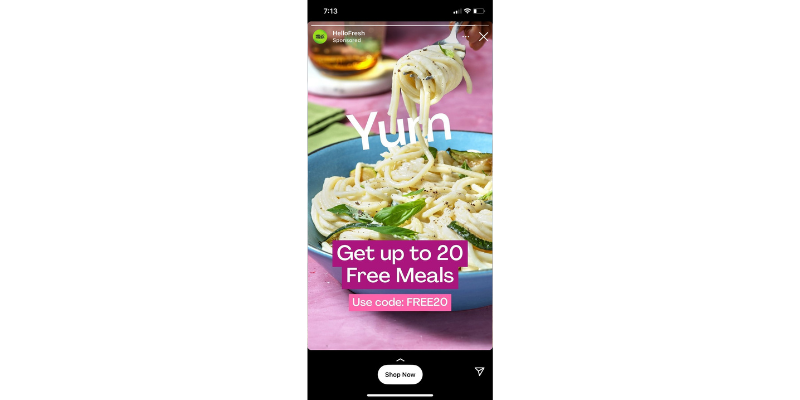
Offering discount codes is a popular way to attract people to your special offer.
You’ve probably seen some of your favourite influencers or brands giving out their personal coupon codes for the products their advertising, which not only encourages people to take the action, but also helps them feel good about saving money.
Why it works
- This specific coupon is offering 20 free meals with their coupon code and no risk factor to the customer
- Codes like “FREE20” reiterate the special discount
10. Thank you for the music (aka, use music to help your CTA stand out)
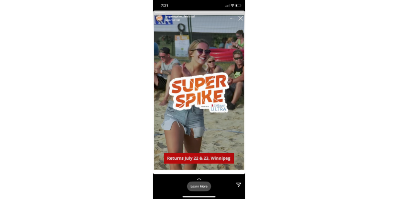
Though pictures can speak 100 words, there’s no shame in adding a bit of music to spice things up. Here we can see how Luscious Orange catches their target audience’s ear with a catchy tune!
Why it works
- This event also features live music, so they’ve added a clip that would be featured at the event to attract their target audience.
- The music in the video has a catchy beat that encourages viewers to stick around and not swipe past the ad immediately.
Uplevel your CTAs today!
Whatever you’re advertising, there is always a creative and outside-the-box way to get your CTA noticed.
Looking for creative CTA copy to help your brand stand out? Drop us a line and let’s chat about your next digital marketing campaign.
