How to Write Newsletters People Want to Read
- by Alyson Shane
This post was guest written by Rose Regier.
If you’ve been around here for a while, you already know that “We’ll just post on Instagram” isn’t a marketing strategy.
If you’re new to these parts and you beg to differ, let us bring you up to speed:
While social media probably should be a huge part of your marketing mix, it’s not everything. Social media is like playing to a crowd at a music festival where hula hoops, kettle corn, and hand-made jewelry are competing with you for your audience’s attention.
Email marketing, on the other hand, is like inviting someone from that crowd to your house to jam.
Now you have them on your front porch, ready to hear the acoustic versions of your songs, and they’ll probably stay and chat after. And there’s the beauty of email - it’s consent-based, it’s personal, and it’s free!
Signing Up for The Goods
Before we talk about the newsletter, let’s talk about the opt-in process.
It’s a good idea to have a marketing strategy for promoting your newsletter. Use your social platforms to tell people why they should sign up, and make it easy for them to do so by linking to an opt-in page and featuring your sign-up box prominently on your website.
Consider giving something away for free when people sign up - this could be a product discount or a free guide to get them interested in your offerings.
This may not be right for everyone though, depending on your business. A lot of people sign up for emails just to get the freebie and then unsubscribe once they get it.
The Welcome Email
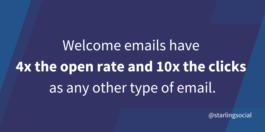
Once they’ve signed up, you have one golden opportunity to start the relationship off on the right foot - the welcome email. Welcome emails have 4x the open rate and 10x the clicks as any other type of email.

Here’s where you deliver your freebie or a discount code if you’re doing that, and also where you set expectations by letting folks know how often they’ll hear from you and what type of content they can expect. Once you’ve told them what to expect, you’d better follow through. Consistency is an important part of building trust with your potential customers.
The Subject Line
What makes people want to open an email in their inbox? Take a look through your own inbox and make note of which promotional emails you’ve opened recently and consider why.
Subject lines personalized to your customers’ interests are the most likely be opened. In fact, this matters more than discounts or time sensitive offers.
Every email you send deserves a unique subject line. “Weekly email” or “Newsletter #27” won’t cut it. Let folks know what’s in this specific email and why they should read it.
Subject lines should be short (less than 10 words), use emojis if appropriate, and contain a hook that gets people curious. Verbs are your friends! Consider using your customer’s name in the subject line to take your personalization up a notch.
Make sure what you’re promising in your subject line is delivered in the email.
Here are some subject lines we love:
- Rock the colour of the year (Etsy)
- Must-have tees from $15 (Everlane)
- How to live at home 24/7 (Feather)
- Where to drink beer right now (Eater Boston)
- 3 rules for marketing during a crisis (Digital Marketer)
The Pre-Header
An email pre-header is the text that follows your subject line, and it’s another opportunity to create interest in opening your email.
Your subject line and pre-header should work together to capture your customers’ curiosity.
Different email providers have different limits on the number of characters, so keep it short and snappy - somewhere between 30 and 80 characters. You can use this space to ask a question, offer an incentive, include a call to action, or to summarize your email.
The Goods
Let’s get into the content of your newsletter. What you write depends on your business and what your customers find valuable. Remember to think about what’s in it for your customer when they open your newsletter. Be energetic in your copy, and use humour if appropriate.
Your newsletter could focus on industry news, products, company updates, testimonials, or blog posts. You can include a mix of all of these, but choose one type of content as your feature.
Start somewhere, and then measure. After a few months, the data will tell you what content is working and what you can ditch.
If you have more than one type of customer, segmenting your email list and sending more personalized content is a good idea.
The Best Time to Send
Recognizing the sender and having time to open an email are the two biggest factors that affect whether people will open your email or not. Given that they’ve subscribed, you can check off the first one.
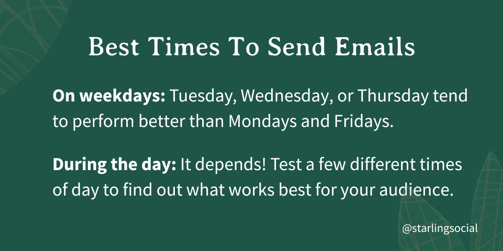
Figuring out the best day and time to send your email newsletter will require some testing, but some recommendations on a starting place are to send your email:
- On weekdays - Tuesday, Wednesday, or Thursday tend to perform better than Mondays and Fridays
- During the day - test a few different times of day to find out what works best for your audience

The Format
The average time spent looking at an email newsletter is 10 seconds, so make it easy to skim by using white space and separating copy into bite-sized chunks. Put the most important information at the top, and use descriptive headers to separate content sections.
Remember that more than half of your subscribers are likely opening your email on their mobile device, so keep this in mind when you’re designing your newsletter. Send test emails and open them on your desktop and phone to make sure the format works for both.
Length
Aim for an average of 20 lines of text, or around 200 words. Any longer than that and you’re probably wasting time on content that won’t get read.
Images
Including images makes your newsletter more visually appealing, but remember that images can also slow down load time which can hurt your open rates.
Start with high resolution images and scale them down to keep them crisp. Optimal image size will depend a bit on which program you use to draft your newsletter. In general, keep file sizes less than 1 mb. Image types can be PNG, GIF, or JPEG. Header images should be 600 pixels wide.
Be sure to include alt text with your image for accessibility.
If you need more help writing newsletters that your customers want to read, we’ve got you!

