4 Social Media Design and Branding Tips From Our Designer
Within a few seconds of landing on your profile, your visitors will decide whether or not they want to follow or subscribe. Most of that decision lies in your online visual identity and how it relates to your brand. Is your content visually appealing? Is it something your audience wants popping up in their feed?
Here are some tips for creating and curating a social media presence that is visually engaging, reflective of your brand and strengthens your visitors’ relationship to you and helps build your brand’s online community.
- Choose the best channels for your audiences
- Curate your content to the platform
- Consistency and cohesion are key
- Create Templates
- Colour and Typography
- Follow Basic Design Principles
- Visual Hierarchy
- Contrast
- Balance
1. Choose the best channels for your audiences
Sometimes it seems like every day there’s a new platform out there. It can be hard to keep up. It’s important to remember your branding goal and not get distracted.
Each platform has its pros and cons. Thanks to analytics and metrics, we have a pretty good idea of who is using them. With that, we can provide a better idea of where to focus your energy.
What platform best works as an extension of your brand? Where are your customers spending their time?
Good branding needs authenticity and so sometimes it’s good to stay in your lane.

2. Curate your content to the platform
Once you’ve chosen your platforms, be sure your content fits the platform. Instagram reels and TikTok videos are meant to be watched on a phone and should be shot vertically. Alternatively, Facebook and Youtube Videos are meant to be filmed and watched in a more traditional horizontal layout.
Size is also important. Instagram images tend to be more square whereas images on Twitter tend to be more wide than tall.
Lastly, consider the type of content that is being put out. Where you might create a long-form explainer video for Youtube, your instagram stories need to be short and to the point.

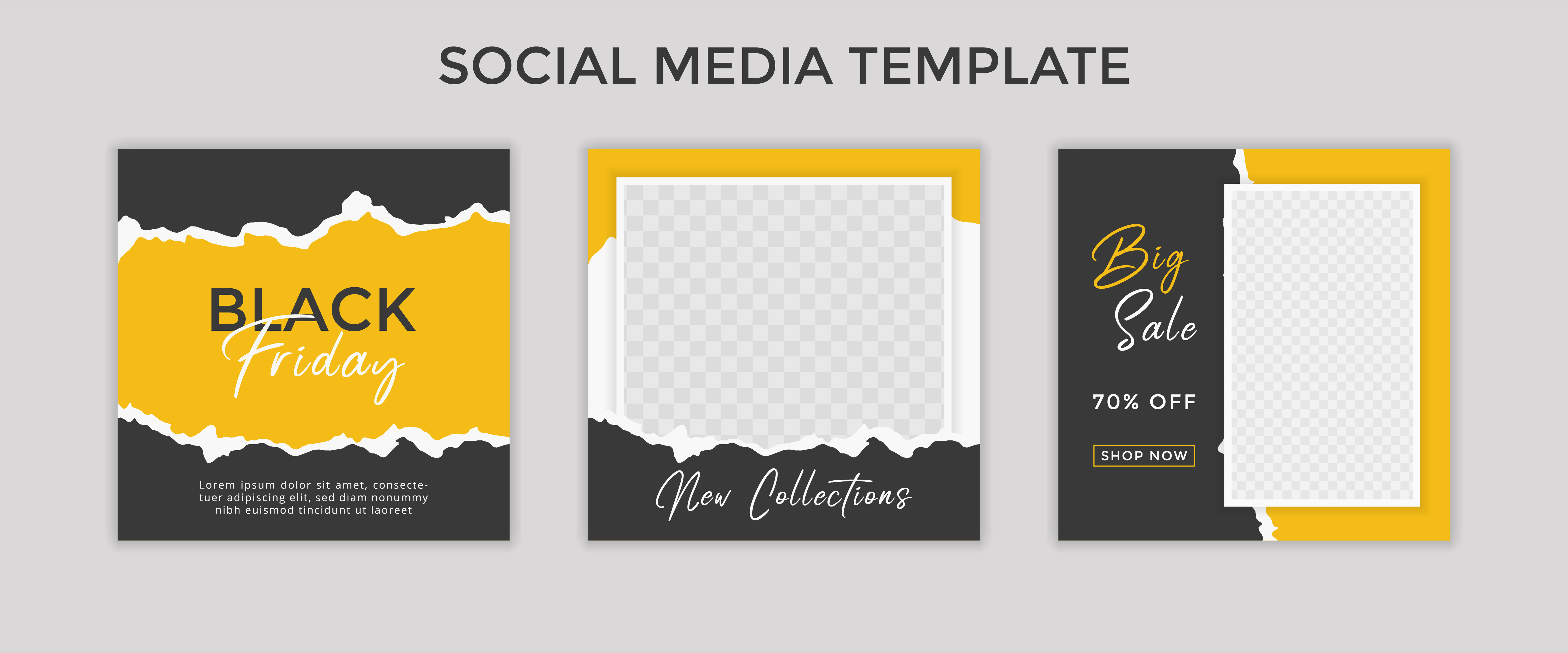
3. Consistency and Cohesion are Key
Social Media is competitive, your little post is up against a seemingly never-ending stream of content. It can be a challenge to stand out. Creating templates and guidelines for content helps create a consistent recognizable presence and there are some great options online to help.
Your posts don’t all have to look identical, but a recognizable theme throughout is important. Think of your posts as siblings and not identical twins.
Find a cohesive look is easier when using similar styles, colour palettes and typography.
Courtesy of Adobe Stock
Here are some things to consider:
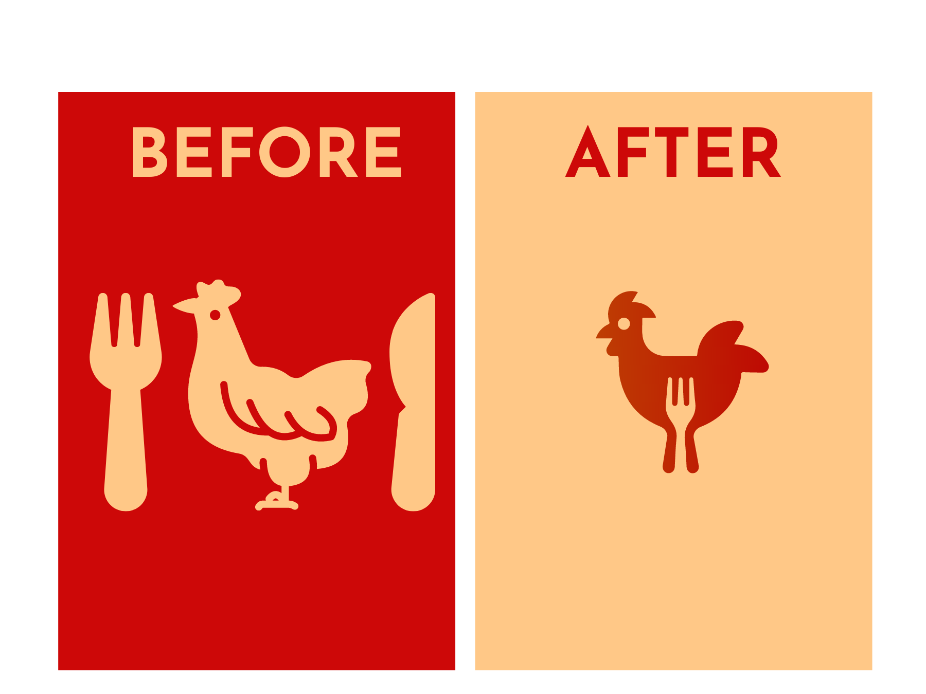
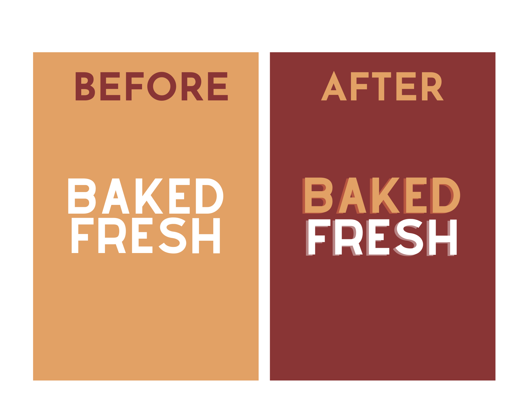
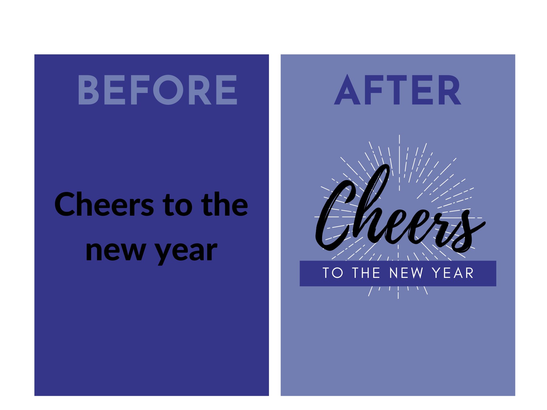
- Typography. If you already have an established brand guideline, try to stick to your existing chosen typography. If not, choose two or three fonts that work with your branding and use those throughout your visuals. Avoid using too many fonts in one visual. This lets your message be the focal point rather than the medium. Typically serif fonts are best for print and sans-serif for web, but that’s not a hard-fast rule.
- Colour. Colour sets the mood, creates an atmosphere. In fact, most snap judgements in marketing are based on colour alone, so choose wisely and find something that reflects your brand persona.
Similar to typography, you want to choose two or three brand colours and use them throughout your visuals. If I say “Support the Blue and Gold” and you think of the Bombers, that’s thanks to consistent visuals.
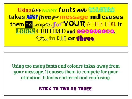
Remember, we are in the business of writing content, not ransom notes.
4. Follow Basic Design Principles
By following three key design principles, you can ensure your content is clear and engaging.
Visual Hierarchy
You may only have a few seconds to get your audience’s attention. Visual hierarchy is a way of laying things out by order of importance. Here are some ways to achieve good visual hierarchy:
Size
The eye naturally goes to the element that takes up the most space. Give top spot to what matters most. This can be through the use of different sized visuals or by writing more important information in a larger font size.
Colour
Highlight important elements by giving them a different colour.
 Use of Space
In design, often less is more. Give your images some breathing room, making them more impactful. Playing with negative space is also a great way to make an impression.
Alignment
Alignment directs the eye to a focal point. Scattered around a page, visual elements like icons and text can get lost. But with the help of alignment, we can establish a sense of direction and establish a clear focal point.
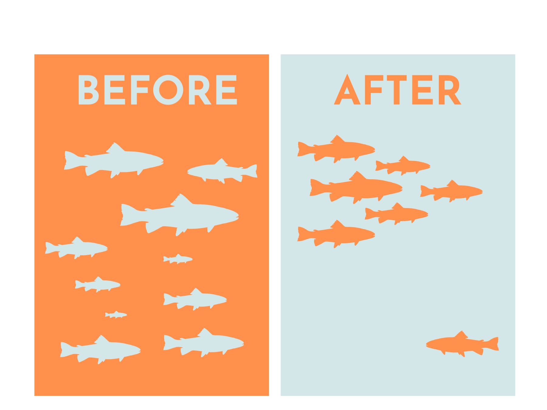
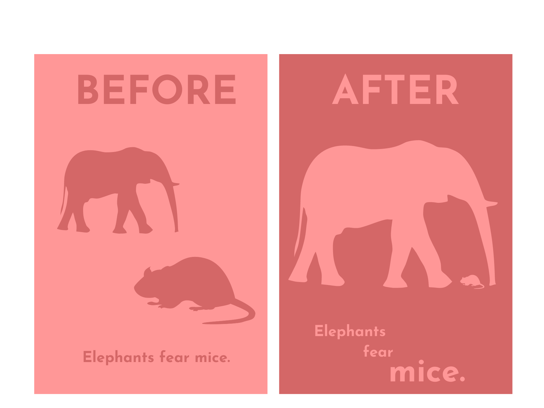
Contrast
Contrast makes designs ‘pop’ and without it, images can look rather flat or cluttered. You can establish contrast in a few ways.
Size
By sizing elements differently, you can create contrast and highlight the most important elements.

Colour:
A pop of colour helps draw the eye in and make your design that much more engaging.
Shape
Contrasting geometric and organic shapes can create visual interest. Using different font styles also helps make your message stand out.
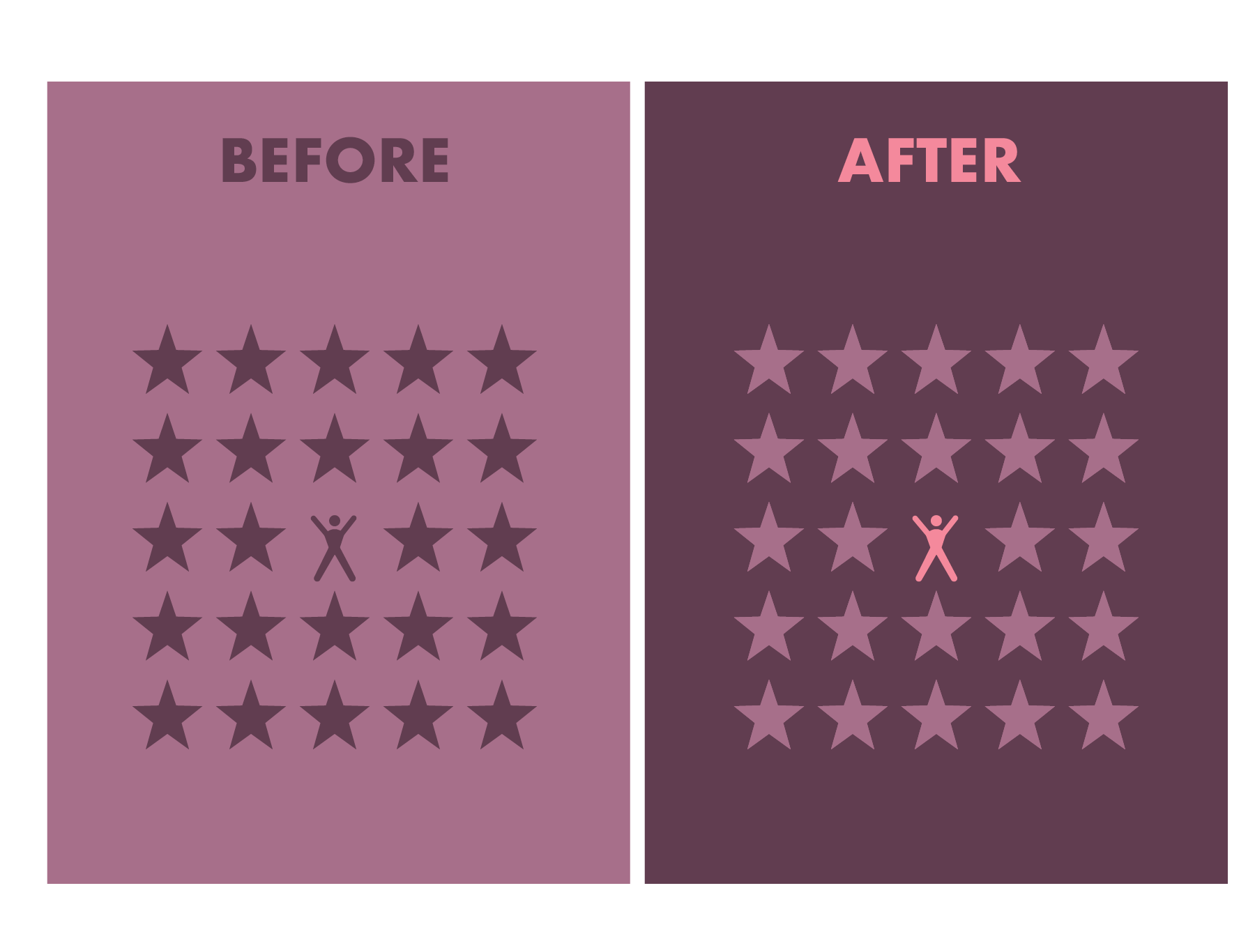
Balance
Balance is essential to good design but is often an afterthought. We might feel that something looks “off” but it’s usually because of a lack of balance. Balance naturally occurs in the world around us and it’s a great foundation for compelling images and graphics.
There are four main types of balance, symmetry, asymmetry, radial and mosaic or crystallographic.
Symmetry
Symmetry is achieved by giving equal weight to elements in an image. The weight can be spread horizontally, vertically, or diagonally. It gives the impression of being mirrored and perfectly balanced.

Image by StockSnap from Pixabay
Asymmetry
Asymmetry occurs when elements in an image are different but equally weighted. Good asymmetrical balance can be a little bit more tricky to achieve but the result can be more striking, playful and engaging than its symmetrical counterpart.
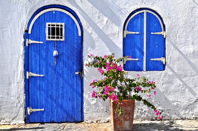
Image by yeshimss from Pixabay
Radial
Radial balance often occurs in nature, think water ripples, tree rings or a snail shell. They draw the eye to the center of the image, to a main focal point. Radially-balanced images are often almost hypnotic and bring feeling of serenity, calm and peace.
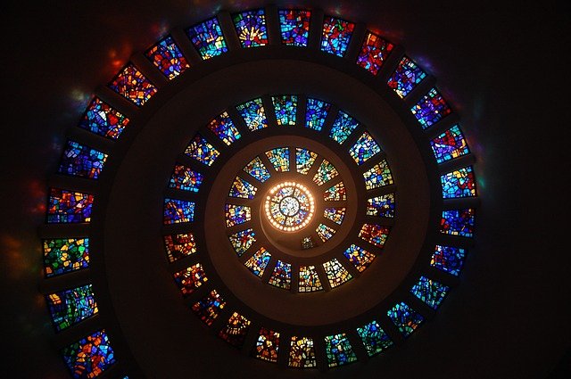
Image by msandersmusic from Pixabay
Mosaic or Crystallographic
In mosaic or crystallographic composition, equal weight is given to many different elements across the image. While the individual elements are not symmetrical, the image as a whole is balanced.
Conclusion
This might be information overload, but we’re here to help.
By keeping these few tips in mind, you can ensure that your social media feed offer customers a consistent and reliable visual identity that is reflective of your brand and worth the follow.
By meeting customers where they already spend a lot of time and offering them content that is engaging and appealing. This only stands to strengthen your online community and brand loyalty.
Ready to start putting these tips into practice? Drop us a line and let’s chat!
Did you like what you just read? Then sign up for our weekly digital marketing email newsletter and get the latest tips, insight, and strategies to grow your business online.